 |
| Reference of comic book layout (google) |
Research:

 Comic book layouts- They are used to help people figure out how to structure a comic page. Understanding how to structure the panels to fit the page can be difficult as sometimes the panel maybe to small for what you want to draw on it. However the layouts are just guide lines and there is the exact way that you have to draw the panels, but it is nice to use these as a reference.

Comic book Covers- The covers of comic books have to be very expressive, they have to be interesting enough to draw the reader in. A normal comic book cover will have a full illustration and the title of the comic, the illustration has lots of bright colours or an interesting pose that will draw the reader in and make them want to read it. Most superhero comic I have noticed used the primary colours and mostly blue and red, colours are very important as they can make the reader feel different things, red shows danger and gets peoples attention, blue is a calm colour that is one of the most popular colours in the world.
Comic books that inspire me:
- Sonic Comics (Archie Comics)
- The Amazing Spiderman (Marvel)
- Captain America (Marvel)
- MegaMan (Archie Comics)
- Lalins Curse (Webtoons/Isaky)
- Lumine (Webtoons/ Emma Krogell)
- My Hero Academia (Kohei Horikoshi)
Other Comic Artists:
Isaky- ( Link ) Her real name is Isabel Terol Martinez who is 25 years old, and she was born in Spain, Isaky has only just started making her comic this year and it has already got over one million views. I love the style of her art and the way she draws her panels, that characters that are in the comic are very interesting and relatable, the story is very slow paced but give us just right amount of tension and Easter eggs to make us want to read more. Before making her comic Lalins curse, she made another comic that has two of the same characters and it a tie in to her new comic, and I enjoy how she doesn't follow cliches in stories, how most alien and supernatural entertainment is set in America so she has set her comic in Spain.
Examples of her work:
Emma Krogell- ( Link ) I don't much about this artist over than her name and comic, She has made a comic series called Lumine, I really enjoy the art that she has and Krogell is really good at drawing wolves. Krogell's comic series is a drama series that is really interesting from the start as it jumps right in to the main character, that you really get to know in the first few pages, there are so many mysterious things about the story that makes you want to read more.
Materials I use to create my comic pages:

I use a Red colour erase pencil for all of my sketching, I use this as the red is not as harsh as the graphite, and when I scan my pages in I can change the settings in photoshop so that the red pencil doesn't show up. If the pencil is a colour erase pencil then you can rub out the the pencil lines.
I use a BIC round stick grip for sketches that I don't care to make about, with a pen you can't erase so if you make a mistake you have to live with it. This can help me have more control of my lines and to not be so worried when I'm just sketching, and I use the colour purple because its my favourite colour.
I use Uni pin fine liners for all of my inking, the pens last for a really long time and are water proof. After I draw my sketch in the red pencil I will go over the lines in one of these pens to make the lines stand out and to refine the messy sketches.
I use Pro markers for all of my traditional colouring, the come in a range of colours and are very nice on the page, as the colour is smooth and flat. They are mage by Winsor and newton, they are in direct competition with comic markers which is the two marker brand.
I use photoshop for all of my digital colouring, I will scan my drawings in using a printer and put them into photoshop. Once in photo shop I will create another layer on to of the scanned drawing layer, and I will change my scanned drawing layer on to a multiply layer so I can now use the other layer to colour us the ink lines of the scanned drawing.
I use a Graphics tablet if I want to draw straight into photoshop and create a artwork in photoshop. I really enjoy using my table as it is much easier to create drawings on a more expressive graphics tablet ( where you can draw own the screen) than a cheeper graphics tablet ( where you can't draw on the screen), for me anyway.
Key Things in Comics:
Strong Characters- Characters that have really good personalities will be more memorable and likeable if they are relatable, as not everyone likes that strong hero that can no wrong, some people like the evil crazy villain. Designs of characters are also important, as you don't want the design to be two boring or ordinary, however that maybe the arts intent to have a generic character that then changes to make him seem less ordinary. Antagonists are some times more important than the protagonist, as if there was no conflict there would be no story it would just be a character going about there day with nothing going wrong, however not all antagonists are evil world conquering super villains they can be just be people that interrupt the protagonist, like a bully.
Expressive poses and action lines- Comic artist have the same challenge as animators, making poses that look like there moving, however the animators get to make the character move but comic artist just have to give the impression of movement. Most comic designers will use action lines to help inforce the pose, if there was a punch the artist will draw lines to show where the fist has been. The poses for comics have to been very expressive, to imitate movement and to basically tell a story, this is some thing that I need to improve on.
Colours and inking- Colours in comics are very interesting, they can sometimes express emotions or make the reader feel a certain way. The flat colours are placed down and then the shading and lighting is what can affect the readers mood, so if the image is very dark and blue it can show sadness, if it is red it can show danger and panic, and yellow and purple can show calm and safety. Inking in comics is interesting, as for some parts of the shading and the black colours the artist will ink it full in black, this can help give a nice solid effect.
The light blue can show power, but also calm making a very cool affect on the character an illustration. Compared with the ink, they use a solid black ink to create a ver interesting contrast of dark and light.
The over all colour that is in this image is a dark blue/purple this gives a very calm effect but also showing that it is night. However the small bits of light (the turquoise and the pink) give of a futurist affect, and the over all hue of the colours is ver pretty that can attract people.
The pencil sketches are very simple, showing the basic figure, some small action lines, and backgrounds. Where as the inked version has a lot more detail especially in the backgrounds, there are solid black patches used for intense shading like under Spiderman and on the other guys back, it shows that there is no light hitting the mans back or under Spiderman.
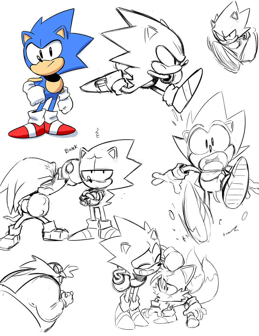

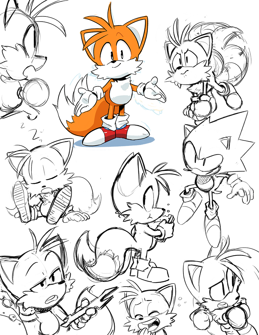

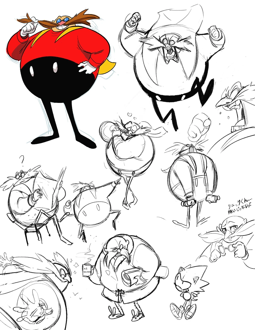
These concept art images have helped me learn how to draw children, and have helped inspired me to make this comic, as the designs are so colourful and vibrate which are very similar to my characters. I really like the poses and character designs, and how they all have very different personalities but can still get along in the story. All of the characters are very different but still likeable for different reasons.
Character prototype : The first design or idea of a character, or character references of the sort of character that you want to create.
Character Profile : A list of questions to help us understand a character more affectively, how tall, ETC.
Character colour code: The main colours or set of colours that are always use in that character eg, warm colours.
Antagonist: A character that is actively opposed or hostile to the protagonist or other character.
Protagonist: A character that is the lead in a story.
Character Arc: Is an inner transformation of the characters personality or views.
Villains: A character who has evil intentions that are important to the plot of the story.
Heros: A character that is admired of the good things that they do in the story.
Character identity: The fact of being who or what a character is.
Character goals: Things that the characters wants to achieve.

 Comic book layouts- They are used to help people figure out how to structure a comic page. Understanding how to structure the panels to fit the page can be difficult as sometimes the panel maybe to small for what you want to draw on it. However the layouts are just guide lines and there is the exact way that you have to draw the panels, but it is nice to use these as a reference.
 |
| Sonic Comic Cover. |

Comic book Covers- The covers of comic books have to be very expressive, they have to be interesting enough to draw the reader in. A normal comic book cover will have a full illustration and the title of the comic, the illustration has lots of bright colours or an interesting pose that will draw the reader in and make them want to read it. Most superhero comic I have noticed used the primary colours and mostly blue and red, colours are very important as they can make the reader feel different things, red shows danger and gets peoples attention, blue is a calm colour that is one of the most popular colours in the world.
Comic books that inspire me:
- Sonic Comics (Archie Comics)
- The Amazing Spiderman (Marvel)
- Captain America (Marvel)
- MegaMan (Archie Comics)
- Lalins Curse (Webtoons/Isaky)
- Lumine (Webtoons/ Emma Krogell)
- My Hero Academia (Kohei Horikoshi)
Other Comic Artists:
Isaky- ( Link ) Her real name is Isabel Terol Martinez who is 25 years old, and she was born in Spain, Isaky has only just started making her comic this year and it has already got over one million views. I love the style of her art and the way she draws her panels, that characters that are in the comic are very interesting and relatable, the story is very slow paced but give us just right amount of tension and Easter eggs to make us want to read more. Before making her comic Lalins curse, she made another comic that has two of the same characters and it a tie in to her new comic, and I enjoy how she doesn't follow cliches in stories, how most alien and supernatural entertainment is set in America so she has set her comic in Spain.
Examples of her work:
 |
| Panel from her Comic |
 |
| Character. |
 |
| Another panel from her Comic |
Emma Krogell- ( Link ) I don't much about this artist over than her name and comic, She has made a comic series called Lumine, I really enjoy the art that she has and Krogell is really good at drawing wolves. Krogell's comic series is a drama series that is really interesting from the start as it jumps right in to the main character, that you really get to know in the first few pages, there are so many mysterious things about the story that makes you want to read more.
 |
| A sketch of her character. |
 |
| Character sketches |
 |
| Character final piece. |

I use a Red colour erase pencil for all of my sketching, I use this as the red is not as harsh as the graphite, and when I scan my pages in I can change the settings in photoshop so that the red pencil doesn't show up. If the pencil is a colour erase pencil then you can rub out the the pencil lines.
I use a BIC round stick grip for sketches that I don't care to make about, with a pen you can't erase so if you make a mistake you have to live with it. This can help me have more control of my lines and to not be so worried when I'm just sketching, and I use the colour purple because its my favourite colour.
I use Uni pin fine liners for all of my inking, the pens last for a really long time and are water proof. After I draw my sketch in the red pencil I will go over the lines in one of these pens to make the lines stand out and to refine the messy sketches.
I use Pro markers for all of my traditional colouring, the come in a range of colours and are very nice on the page, as the colour is smooth and flat. They are mage by Winsor and newton, they are in direct competition with comic markers which is the two marker brand.
I use photoshop for all of my digital colouring, I will scan my drawings in using a printer and put them into photoshop. Once in photo shop I will create another layer on to of the scanned drawing layer, and I will change my scanned drawing layer on to a multiply layer so I can now use the other layer to colour us the ink lines of the scanned drawing.
I use a Graphics tablet if I want to draw straight into photoshop and create a artwork in photoshop. I really enjoy using my table as it is much easier to create drawings on a more expressive graphics tablet ( where you can draw own the screen) than a cheeper graphics tablet ( where you can't draw on the screen), for me anyway.
Key Things in Comics:
Strong Characters- Characters that have really good personalities will be more memorable and likeable if they are relatable, as not everyone likes that strong hero that can no wrong, some people like the evil crazy villain. Designs of characters are also important, as you don't want the design to be two boring or ordinary, however that maybe the arts intent to have a generic character that then changes to make him seem less ordinary. Antagonists are some times more important than the protagonist, as if there was no conflict there would be no story it would just be a character going about there day with nothing going wrong, however not all antagonists are evil world conquering super villains they can be just be people that interrupt the protagonist, like a bully.
 |
| Spiderman character illustration. |
 |
| Sonic And Amy illustration. |
Expressive poses and action lines- Comic artist have the same challenge as animators, making poses that look like there moving, however the animators get to make the character move but comic artist just have to give the impression of movement. Most comic designers will use action lines to help inforce the pose, if there was a punch the artist will draw lines to show where the fist has been. The poses for comics have to been very expressive, to imitate movement and to basically tell a story, this is some thing that I need to improve on.
 |
| Expressive pose of Spiderman. |
 |
| Sonic comic page showing action lines. |
Colours and inking- Colours in comics are very interesting, they can sometimes express emotions or make the reader feel a certain way. The flat colours are placed down and then the shading and lighting is what can affect the readers mood, so if the image is very dark and blue it can show sadness, if it is red it can show danger and panic, and yellow and purple can show calm and safety. Inking in comics is interesting, as for some parts of the shading and the black colours the artist will ink it full in black, this can help give a nice solid effect.
 |
| Black lightning with blue lighting. |
 |
| Spiderman with lighting |
 |
| Spiderman pencil to ink comic page. |
Inspiration


These concept art images have helped me learn how to draw children, and have helped inspired me to make this comic, as the designs are so colourful and vibrate which are very similar to my characters. I really like the poses and character designs, and how they all have very different personalities but can still get along in the story. All of the characters are very different but still likeable for different reasons.
Glossary.
Character prototype : The first design or idea of a character, or character references of the sort of character that you want to create.
Character Profile : A list of questions to help us understand a character more affectively, how tall, ETC.
Character colour code: The main colours or set of colours that are always use in that character eg, warm colours.
Antagonist: A character that is actively opposed or hostile to the protagonist or other character.
Protagonist: A character that is the lead in a story.
Character Arc: Is an inner transformation of the characters personality or views.
Villains: A character who has evil intentions that are important to the plot of the story.
Heros: A character that is admired of the good things that they do in the story.
Character identity: The fact of being who or what a character is.
Character goals: Things that the characters wants to achieve.


No comments:
Post a Comment